Data & AI
Dashboards Are Not for Overview
Why the most common brief in data product design is also the most limiting — and what to ask instead
Mar 2024 · 6 min
Every dashboard project starts the same way.
You ask the stakeholder what they need. They lean back, think for a moment, and say: "We just need an overview. Something where we can see everything at a glance."
It sounds reasonable. It sounds like a clear brief. It is neither.
The request for an overview is not a design requirement. It is a symptom — of distance. Distance between the people who need to make decisions and the data that should be informing them. When someone asks for an overview dashboard, what they are actually saying is: "I don't trust that I'm seeing what matters, when it matters, in a form I can act on."
That is a fundamentally different problem. And it demands a fundamentally different response.
The Real Job of a Dashboard
A dashboard has one job: shorten the distance between data and decision.
Not to display data. Not to provide visibility. Not to give an overview. Those are means, not ends. The end is always a decision or an action — something a person does differently because of what they saw.
If a dashboard doesn't reliably produce decisions or actions, it is a reporting artifact. It may be a beautiful one. It may impress in a demo. But it is not doing the job.
The distance between data and decision has three gaps inside it — and most dashboards only close one of them.

Gap one: the data gap
The data exists but isn't trusted. It's incomplete, inconsistently defined, or arrives too late to be actionable. A dashboard built on untrustworthy data doesn't just fail — it actively misleads. Precise numbers presented with confidence are more dangerous than no numbers at all when the underlying data is unreliable.
Gap two: the sense-making gap

The data is available and trustworthy, but the user can't make sense of it fast enough to act. This is where most dashboard design fails. Charts are chosen for what a library makes easy rather than what the data needs to communicate. Information is displayed rather than directed. The user is handed raw material and asked to do the analytical work themselves.
Gap three: the decision gap
The data is trustworthy and understandable, but the dashboard doesn't connect understanding to action. There is no clear next step. No prompt. No path from insight to response. The user understands what is happening but the interface doesn't help them do anything about it.
A dashboard that closes all three gaps doesn't feel like a dashboard. It feels like clarity.
The request for an overview is not a design requirement. It is a symptom of distance between people and the data that should be informing them.
What to Ask Instead
When a stakeholder asks for an overview dashboard, the right response is not to start sketching layouts. It is to ask three questions.
Who makes decisions from this data — and what decisions are they making? Not who will have access to the dashboard. Not who requested it. Who actually acts on the information, and what does acting look like? A financial controller and an operations manager may be looking at the same underlying data but making completely different decisions on completely different timescales. One dashboard serving both will serve neither well.
What does the data need to say for the right action to be obvious? This is the visualisation brief hiding inside the stakeholder request. Not "show me vessel performance" but "show me which vessels are underperforming against their expected margin this month, in a way that makes the cause immediately apparent." That is a solvable design problem. "Give me an overview" is not.
What does a good decision look like — and how fast does it need to happen? Tempo matters. A dashboard for a trading floor and a dashboard for a monthly operational review are not the same product with different data. The decision velocity shapes everything: the refresh rate, the level of aggregation, the prominence of alerts, the depth of drill-down. Designing without understanding tempo is designing without understanding the user.
The Overview Is the Last Thing You Design
Here is the reframe that changes how dashboard projects run:
The overview is not the starting point. It is the destination — the thing you arrive at once you understand the decisions, the data, and the users deeply enough to know what overview actually means for this context.
You do not design an overview and hope decisions follow. You design for decisions and let the overview emerge from that clarity.
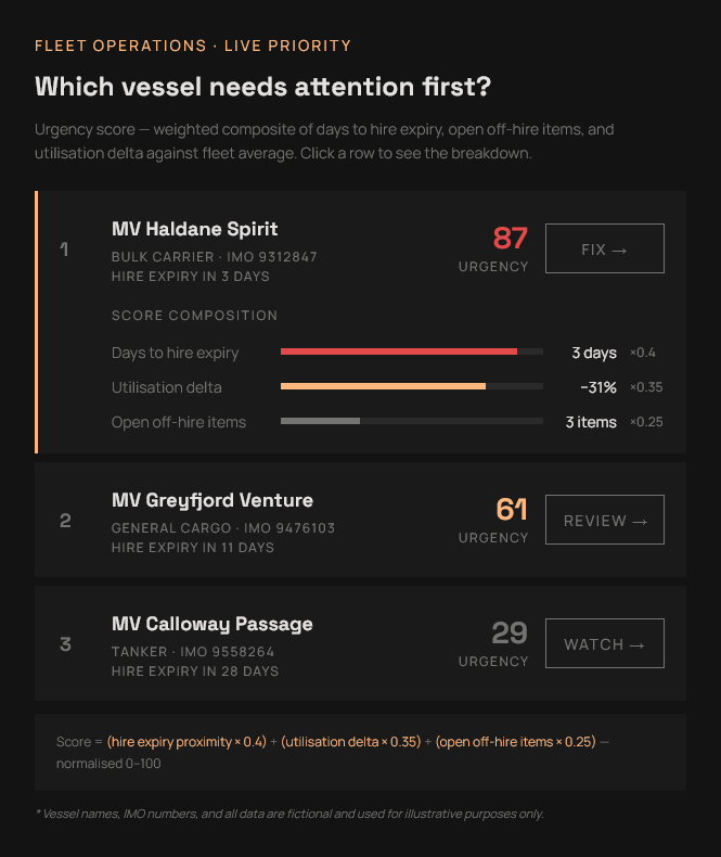
FLEET OPERATIONS · LIVE PRIORITY
Which vessel needs attention first?
Urgency score — weighted composite of days to hire expiry, open off-hire items, and utilisation delta against fleet average. Click a row to see the breakdown.
MV Haldane Spirit
Bulk Carrier · IMO 9312847
HIRE EXPIRY IN 3 DAYS
MV Greyfjord Venture
General Cargo · IMO 9476103
HIRE EXPIRY IN 11 DAYS
MV Calloway Passage
Tanker · IMO 9558264
HIRE EXPIRY IN 28 DAYS
Score = (hire expiry proximity × 0.4) + (utilisation delta × 0.35) + (open off-hire items × 0.25) — normalised 0–100
* Vessel names, IMO numbers, and all data are fictional and used for illustrative purposes only.
The dashboards that earn trust — the ones that get used every day rather than opened once and forgotten — are never the ones that showed everything. They are the ones that showed exactly the right thing, to exactly the right person, at exactly the moment they needed to act.
That is a much harder brief than an overview. It is also the only brief worth designing for.
The right problem.
The right partnership.
Open to the right full-time leadership roles and consulting partnerships. If the problem sits at the intersection of design, data, and technology — let's talk.